Blog
What Makes a Business Sign Stand Out?
Making a good first impression is imperative, especially for locally owned business. Unlike chain brands, locally owned business often makes their first impression on the community through their signage and promotions as opposed to having a reputation that reached potential customers prior to opening. Instead, new local business has to build their own awareness through more traditional avenues to reach the immediate community most likely to patronize their establishment.
But what makes one sign stand out? The answer is much more simple than most imagine. In fact, it comes down to five tips to keep in mind while creating a design.
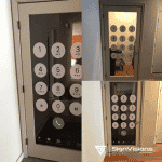
Legibility
It’s tempting to choose a crazy font to get more attention. However, most people have very little time to read a sign over while passing by. This means they are unlikely to take the time to read a sign or may not have the time even if they wanted to. By making fonts legible, it’s more likely someone will bother to read your sign.
Readable
Similar to being legible, wording should also be readable. To be readable, highlighting and color selections are made with the readability of the actual letters in mind, including spacing. There should be enough space between letters and highlights should be used to increase the ease of reading rather than trying to spice it up.
Pop
Adding some pizazz can go a long way. Keeping the above tips in mind, this extra pop should not take away from the ease in reading the wording. Instead, it should be a pop of color or an image that gets people to look at the sign without taking away from their ability to read. The pop should avoid placement on lettering and, in most circumstances, should not be the wording itself, unless it’s a small word unrelated to branding such as “wow!”
Colors and Images
Keeping it simple is a good rule of thumb but colors and images should be implemented to ensure simplicity isn’t a lack of creativity. Choosing high contrast is both interesting and easy to read on the go.
Change Up Messaging
When you update your sign, it should be a real update. If you have a digital sign, it should have different messages. When you work with window graphics or temporary signs, they should stand out from your other signs. Keep your audience engaged and interested in what you will do next.
If you need help getting started, contact our team today for more information about our services.